Overview
The realm of design and what it really involved was initially vague to me as I began my journey as a designer at the beginning of the year. However, throughout this semester, the exposure I’ve gained to design principles and processes has solidified and instilled in me a greater appreciation and insight on how crucial design is to the success of any project or product. The semester-long project I worked on was designing a mobile platform called Effective Giving that would help people learn about effective charities and help them make more meaningful charitable donations. By having the opportunity to work on a group project that involved applying a wide range of design research methods and making design decisions based on our user data and design guidelines, I’ve gathered several key takeaways that I feel are integral to the design process. The five main points that define my design process are:
- Users will have different backgrounds and needs, from each other and the designers, and have varying opinions on what is intuitive or useful.
- It is important to keep your product’s goals and vision in mind to make insightful decisions on what design revisions are necessary.
- Finding the balance between simplicity and creative functionality is crucial to a clear, usable design.
- Accessibility can take many forms and is necessary for appealing to a wider range of users.
- Having a code of ethics is important for reminding designers to prioritize the wellbeing of users.
Users are different from each other and designers
Designers cannot rely solely on their own perceptions about whether a design is usable and effective because they have different backgrounds and skillsets from users who will ultimately be using the product. During the conceptualization period of the design process when designers are identifying these target users that they want the product to appeal to, it is necessary to categorize users into groups to narrow down design functionalities. When choosing the user groups that we wanted our Effective Giving platform to target, we brainstormed three groups that we thought would use our product: members of religious organizations, members of larger charitable organizations, and effective altruists. It became clear as we conducted contextual inquiries and interviews with these groups that these users had some interesting perspectives that we did not consider before, such as the value of familiar human interaction and in-person interaction when giving to charity, and the desire to help charities in non-monetary ways. We then shaped our designs according to these concerns.
Likewise, during our usability tests, aspects of our design that were intuitive to us sometimes confused our user participants. For example, we thought that placing the “Donate” button, which users can click on to make a donation to a specific charity, at the very bottom of the charity profile page made sense since we wanted users to finish learning about a charity before giving them the option to donate. However, one of our participants could not find the button or realize that he could donate from the app since a link to the charity’s website was above it and he assumed that he needed to navigate to that link to make a donation.
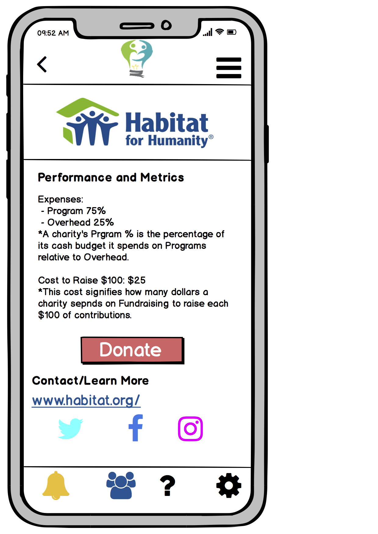 As a result, we chose to move our donation button above the charity’s contact information but below the text about the charity to make it easier to find while still encouraging users to learn about the charity first.
As important as it is to consider how users have different opinions from designers, it is also crucial to keep in mind that users are different from each other. What may seem intuitive to one user may baffle another. Our team encountered this during our usability testing in which two of our participants had found the process of learning about effective charities and making donations straightforward in our app and did not need much guidance, while another participant felt that he needed a more structured guide to help him investigate charity options.
Although it is necessary to generalize users into target groups for practicality and focus in the design process, designers should be aware of the differences between users. Therefore, the design must be general and accessible enough to account for these user differences rather than geared too specifically to certain demographics. The iterative design process is a good measure of whether the design is usable to a wide range of users. As the design is refined and improvements are made, a reduction in the number of significant user issues during testing is a good sign that the design is becoming more usable. For our project’s testing process, we conducted heuristic evaluations and three usability tests. The further we proceeded into testing, making refinements to our design based on feedback at every step, we received less severe user concerns.
Balance between simplicity and functionality
As designers gather these different user perspectives with research and testing during the design process, it is ultimately up to them how they want to revise their designs according to the results received. It is necessary for designers to parse through all the feedback and user concerns received during testing and research to rank issues based on severity and decide which ones should be dealt with when revising the design. In our Effective Giving project, for example, it would not be feasible to revise the design for every suggestion we received, nor would it be particularly wise.
In the design process, the generating and expanding of ideas during the ideation phase is necessary for coming up with creative functionality while the narrowing down of ideas in the testing phase is crucial for achieving simplicity. Both are equally important in good design. After brainstorming features and identifying themes from our design research for our initial Effective Giving platform, we had to narrow down our ideas and forego certain design features for the sake of a straightforward and simple to use design.
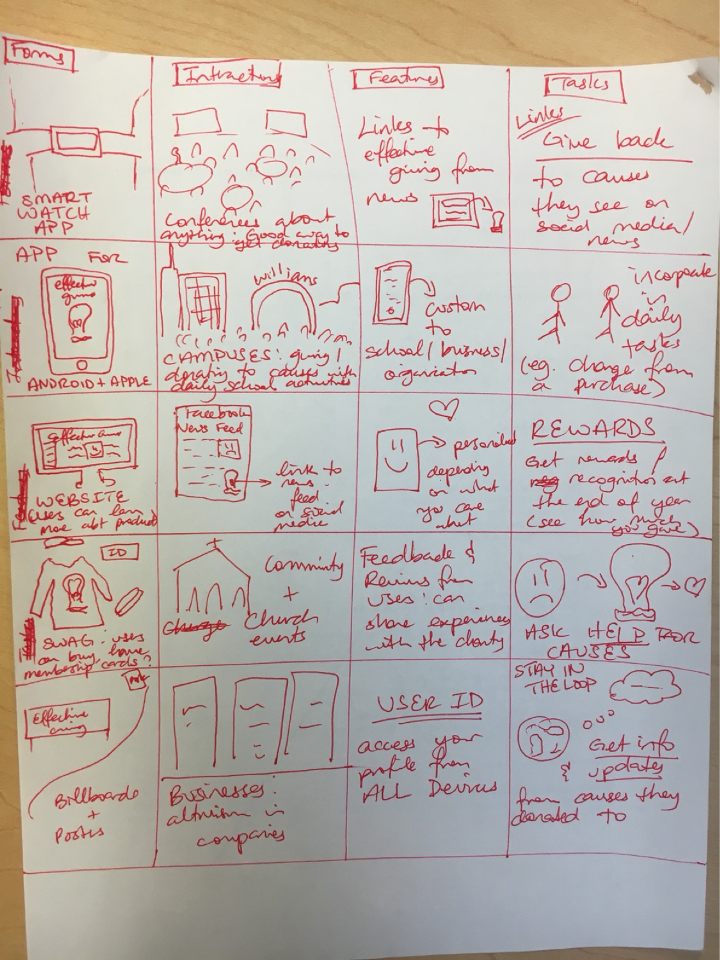 Sketch of some of my initial ideas for the project
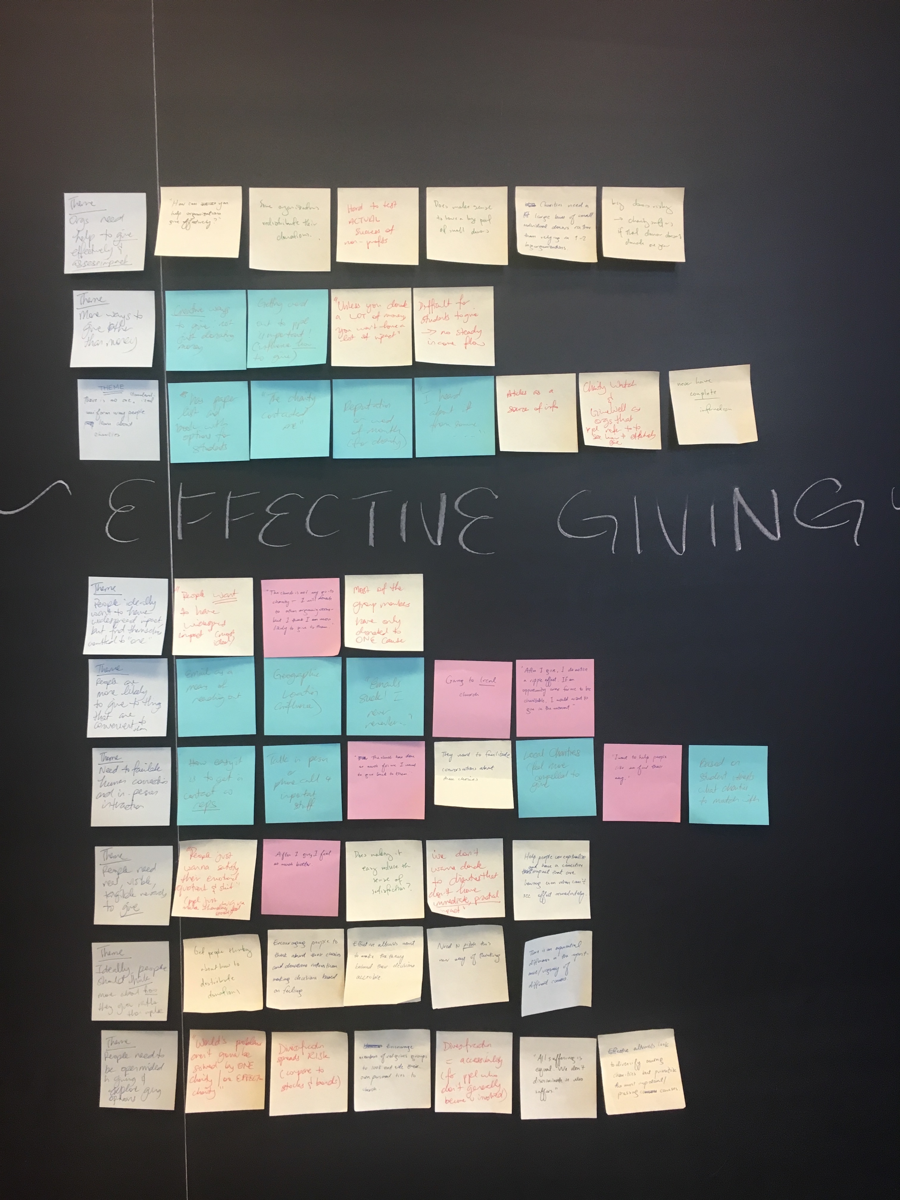 Our affinity diagram which organized user data received during our testing process into higher-level themes
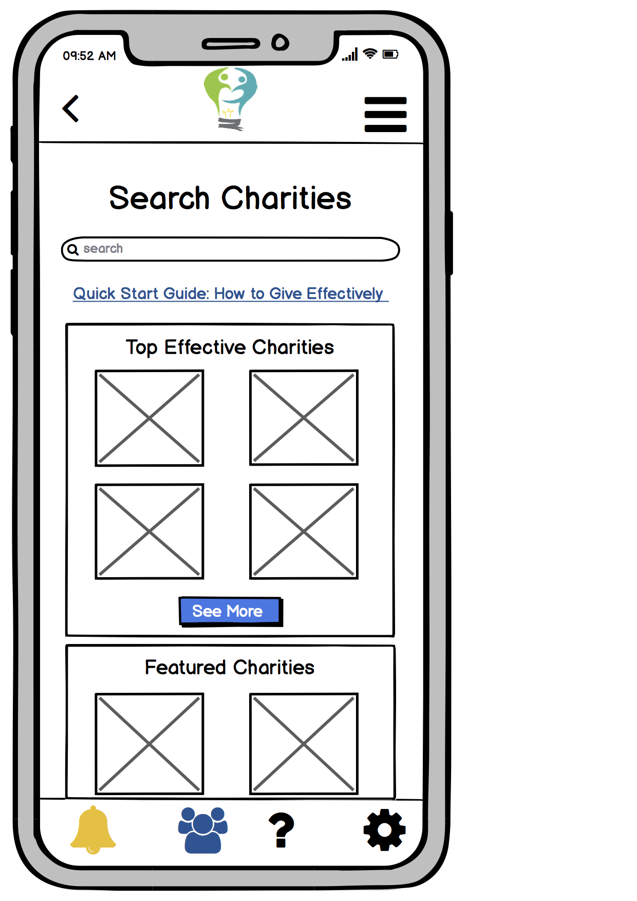
Following the guidelines for refining a design outlined in Designing for Interaction by Saffer, a good tip for integrating functionality without making the design confusing is to follow industry standards (Designing for Interaction, pp 134). In our mobile application, we followed established industry standards such as placing the back button at the top left, the nav bar at the top right, and menu options at the bottom of the screen. Adhering to these conventions that users are already used to allows for them to navigate our application more smoothly. To further simplify our design to a wide range of users, we also employed interface metaphors that most people are familiar with, which helps users better understand the product and accomplish their tasks, as outlined in Interaction Design by Rogers, Sharpe & Preece (Interaction Design,pp 403-405). In our application, we employed familiar metaphors such as a bell icon to represent notifications, a human figures icon to activities with other users, a question mark icon to represent our help page, and a screw icon to represent settings (shown below).

Oftentimes, when faced with the decision of whether to get rid of or add a feature, it is useful to ask yourself if the feature is in line with the major user tasks that the design should facilitate. It is unnecessary to add complicated features that do not play a significant role in helping users accomplish their goals. Features we had originally generated for our mobile platform such as location tracking features and allowing users to send “gifts” of donations to another user’s favorite charity never made it to our final design because although they were creative, they would have overcomplicated simple user tasks of learning about and donating to effective charities, which were integral to our design.
Keep product goals and vision in mind when making design decisions
Along with striving for clarity by avoiding features that would overcomplicate the design, usability is not the only thing that defines a good design. It is also vital that the design of a product reflects the overall vision of the product and what it hopes to achieve. One lesson I’d learned from working on Effective Giving is the importance of keeping in mind the goals of our platform and the vision we have for it when making decisions about design revisions. It is easy to get caught up in wanting to please everyone that designers may lose focus on what the product’s purpose is. At times, feedback and user suggestions for possible design revisions are not necessarily features that would overcomplicate the design but may detract from the product’s purpose.
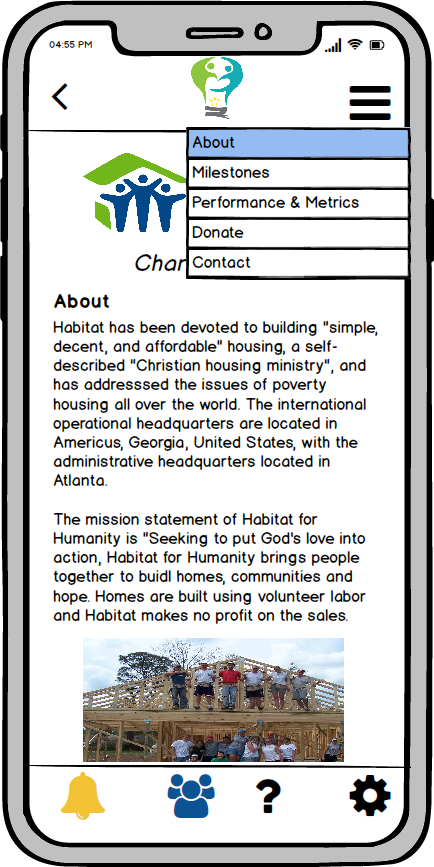
One of the main goals of the Effective Giving platform is to encourage users to learn about the effectiveness of charities, and one way we hoped to achieve this is by placing the “Donate” button that allows users to donate to a particular charity at the bottom of the relevant charity profile below all the textual information about the organization. This is to nudge users to learn more about a charity before making a donation. One of the suggestions we received early in the testing process is to move the donate button to the top of the page for convenience. Although this change would not make our design more complicated, it was not in line with our platform’s goals. Therefore, we chose to not incorporate this suggestion in our design revisions and left the button at the bottom of the page. As a compromise, we decided to allow users to navigate to different sections of the charity profile from the navigation bar to make accessing the donation button more convenient for experienced users (shown below).
Staying true to the product’s vision helps designers be mindful of the design’s focus and better evaluate how the design helps users accomplish their tasks and goals rather than simply how usable it is.
Accessibility
Making a design accessible can take different forms, but it is essentially presenting the product in such a way that it appeals to and is usable by a wide audience. This is another reason why it is necessary to develop designs that, although may be geared towards certain user groups, is general and usable enough so that significant user populations are not excluded. When considering accessibility of a design, it is helpful to apply the POUR Methodology outlined by Smyk, which asks the important question: is your design Perceivable, Operable, Understandable, and Robust?
Our Effective Giving platform has the goal of making charitable donations more accessible to the general public. To address accessibility concerns for users who are not very experienced with giving to charity, we included helpful resources in our application such as a link to a guide that informs users on how to approach the donation decision-making process on the home screen, charity profiles that give general structured summaries with the most important information about particular charities rather than forcing users to parse through information online, and pictures in charity profiles to better engage users who might get bogged down by all the textual content.
 Link to guide to help users give effectively
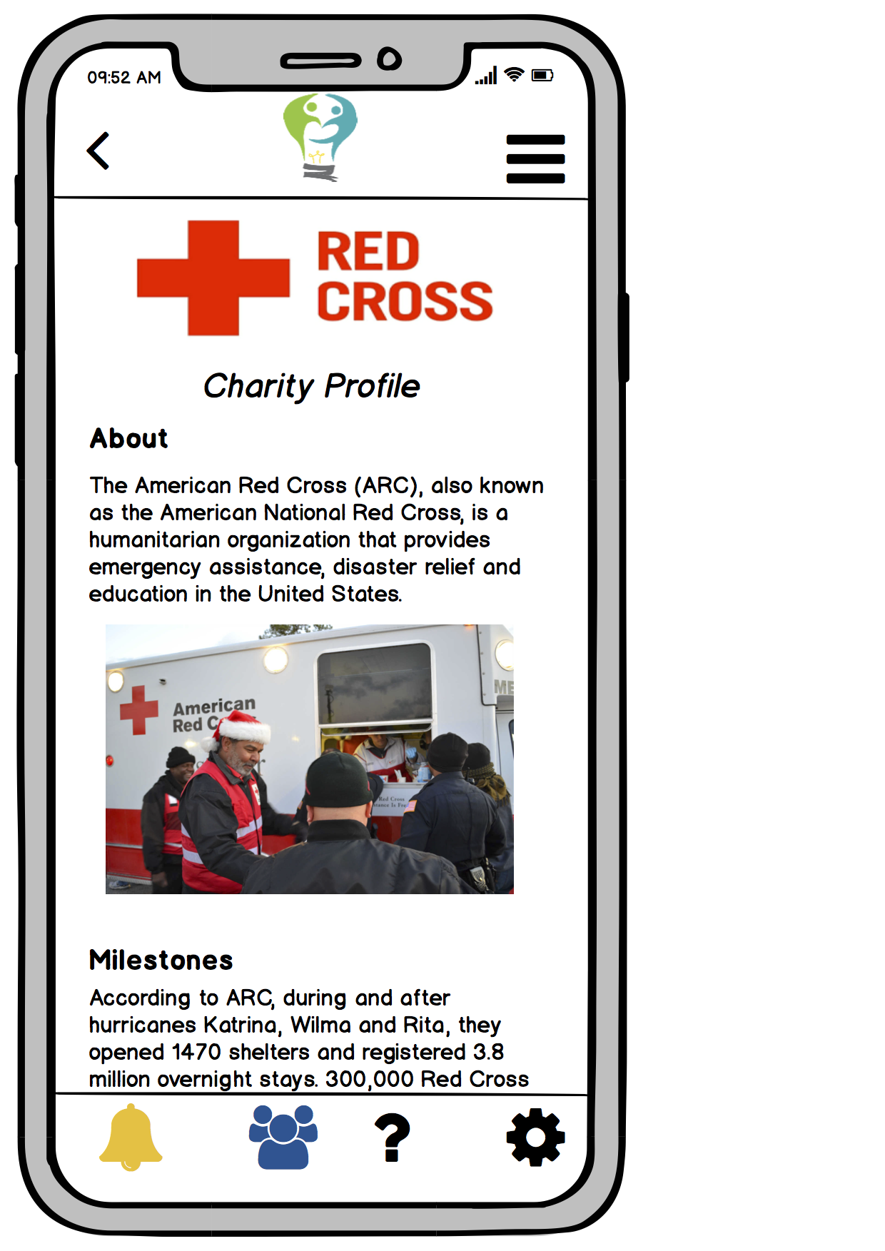 Charity profile with relevant summary information and pictures
We maintained a simple layout throughout the application, with clear headings and familiar icons.
Our project website was made more accessible by providing clear alt text for each of our images, as well as condensing our headers and maintaining a minimal layout on our webpages (mostly just relevant textual information and pictures) without extraneous design components to make it easier for users who use screen readers to navigate our website. We also employed a responsive design in order to allow for smoother translation across different platforms.
There are other accessibility concerns that could have been addressed in our mobile platform that we did not employ or explicitly convey in our final design because of the time constraints of our project. Other ways we had considered making our application more accessible are spelling help and suggested results in the search bar where users search for charities, and customizing the currencies and charities that users see based on their geographic location to appeal to users across the globe. Accessibility concerns should be addressed from the very start of the design process since it is much easier to design with accessibility in mind rather than fixing your design later to address these issues.
Code of Ethics
As with any process that has an impact on people’s lives and wellbeing, the design process must follow established ethical principles. A useful resource that can guide designers in considering ethical concerns is the ACM code of ethics, which provides a good overview of moral imperatives that should guide design. Throughout our design process this semester, our actions and decision-making process were governed by several ethical guidelines:
-
Credit for others’ intellectual property: Including relevant citations and sources for other people’s content we used in our website, application designs and presentation is crucial, not only for legal purposes but also out of respect for other people’s work.
-
The right to privacy and protection: When conducting contextual inquiries, interviews, and usability tests, we assured participants that their identities would remain anonymous and that the information they shared would not be used against them. A feature of our mobile platform that ensures the privacy of users is having them create user profiles in which they would need a password to log in and access their data, which includes their payment information and the charities they are interested in and donate to. Although this feature is not explicit in our final design because it did not fall within our major user tasks we wanted to highlight, the ability to secure user information was an important consideration we made early in our design process.
-
The right to free choice without deception: Since our platform encourages users to donate money effectively, ethical concerns regarding preserving users’ freedom of choice arose quite frequently. We wanted Effective Giving to guide rather than dictate to users what causes they should give to. We did not want to restrict users from donating to charities that were not as effective as others, but rather we wanted them to make those decisions on their own. Our platform provided users with recommendations of “top effective” charities and guidelines to giving effectively but it was ultimately up to the users to learn about different causes and organizations and deciding which ones they wanted to donate to. Even though some charitable causes may be more pressing than others, the application gives users the ability to select which causes they care about and see related charities. Users also had complete control over their donation options, opting in to monthly recurring donations only if they wanted to, and they could change their donation preferences at any time. Preserving the freedom of choice of users was an important concern to our team, especially since users would be making financial transactions on our platform. During our design research and testing processes, we also ensured that participants knew they had control over their participation and could leave or stop the process at any time if they felt uncomfortable.
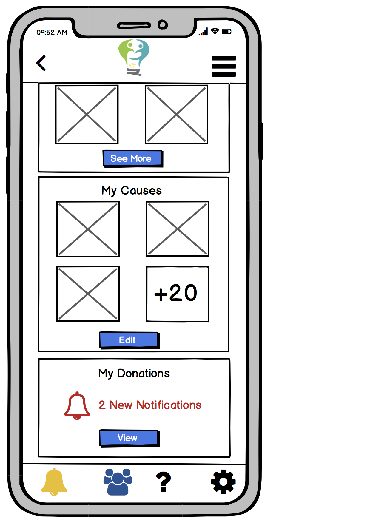 Users can select causes they care about
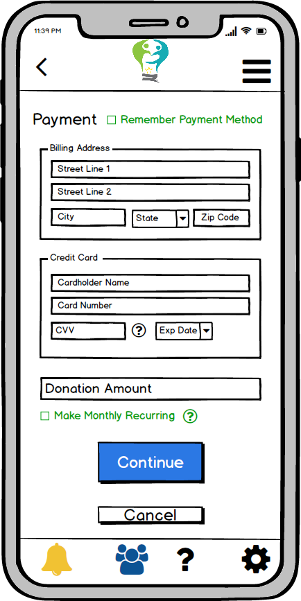
Monthly recurring payments option is opt-in
- The right to access accurate and unbiased information: We chose to present information about charities to our users through charity profiles that contained verifiable information and unbiased assessments of charities’ effectiveness from credible third-party resources such as GiveWell and Charity Watch that are involved with assessing charitable organizations. We felt that this was a more accurate and holistic representation of the effectiveness of a charity than pulling information straight from the organization’s website. During our design testing and research processes, our participants were informed beforehand what the tests and contextual inquiries would involve.
Although different ethical considerations are given varying weight based on the nature of the product being designed, ultimately designers should be cognizant of how their designs affect users’ wellbeing and the consequences that may stem from design decisions.
Conclusion
These takeaways are applicable to any design process, beyond the mobile platform project I worked on this semester. Ultimately, design shapes how effective a product is, who it appeals to, and how people interact with it. It is a continuous process that involves iterations of user testing, selective design revisions, and balancing simplicity and functionality, all while ensuring that the product is accessible and prioritizes the wellbeing of users.