It stands out.
I chose this design because it is quite different stylistically from many of Williams’ webpages. A key feature that makes it distinct is its dark background, a stark contrast to the white backgrounds found on most of the college’s webpages. This is for a good reason. Teach is Forward is a campaign aimed at improving the college by raising $650 million, and much of it involves soliciting donations from alumni. With an ambitious goal like this, it makes sense that the website is correspondingly innovative. It should stand out among the college’s main webpages.
It is thorough and aligns with the purpose of the campaign.
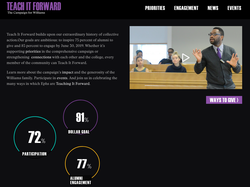
The design lines up well with the website’s purpose: to persuade members of the Williams community to be a part of something grand, personal, and exclusive to the college, characteristics that are better conveyed with the site’s darker background than say a conventional white one. A great feature of the homepage is the lack of clutter (not too much text, and an introductory video to complement the short description). Williams alumni are busy people, and the clear, straightforward nature of the website is ideal for capturing and maintaining their interest. The choice of links displayed is also thought out and purposeful. One of the major driving forces behind this campaign is endowment support from alumni, so it makes sense that “Ways to Give” is a button that strategically appears on the homepage. The button is bold enough to be noticeable yet it is unobtrusive.
It is clear-cut and the variety of links that are situated on the page reflect this characteristic. They are subtle yet effective signifiers. When you mouseover bolded key words in the description such as “priorities” and “impact”, or the circles with the percentages at the bottom, you are taken to a corresponding page centered around the topic. This is handy if you quickly want to know more information about a certain campaign aspect without having to bother with the navigation bar on the top left.
It comes across as useful and understandable to the user.
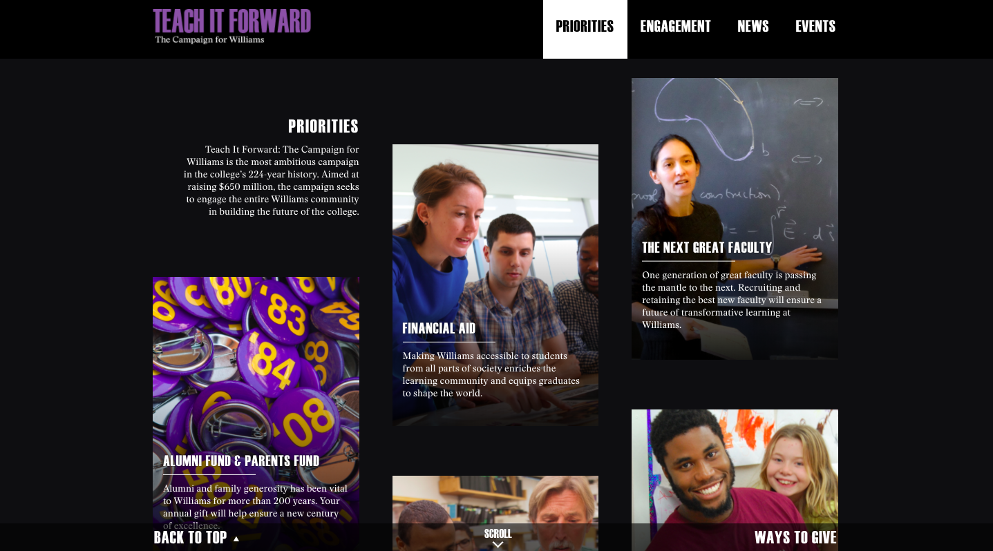
The navigation bar, however, is clear and includes the vital information that can answer most of the important questions that a Williams alumnus might have: What are the areas of focus in the campaign? How can I get involved? What’s the current status of the campaign and what events and programming have been done in the past? The page above displays the campaign’s priorities after clicking on the relevant option from the navigation bar. Below is the page for campaign news.
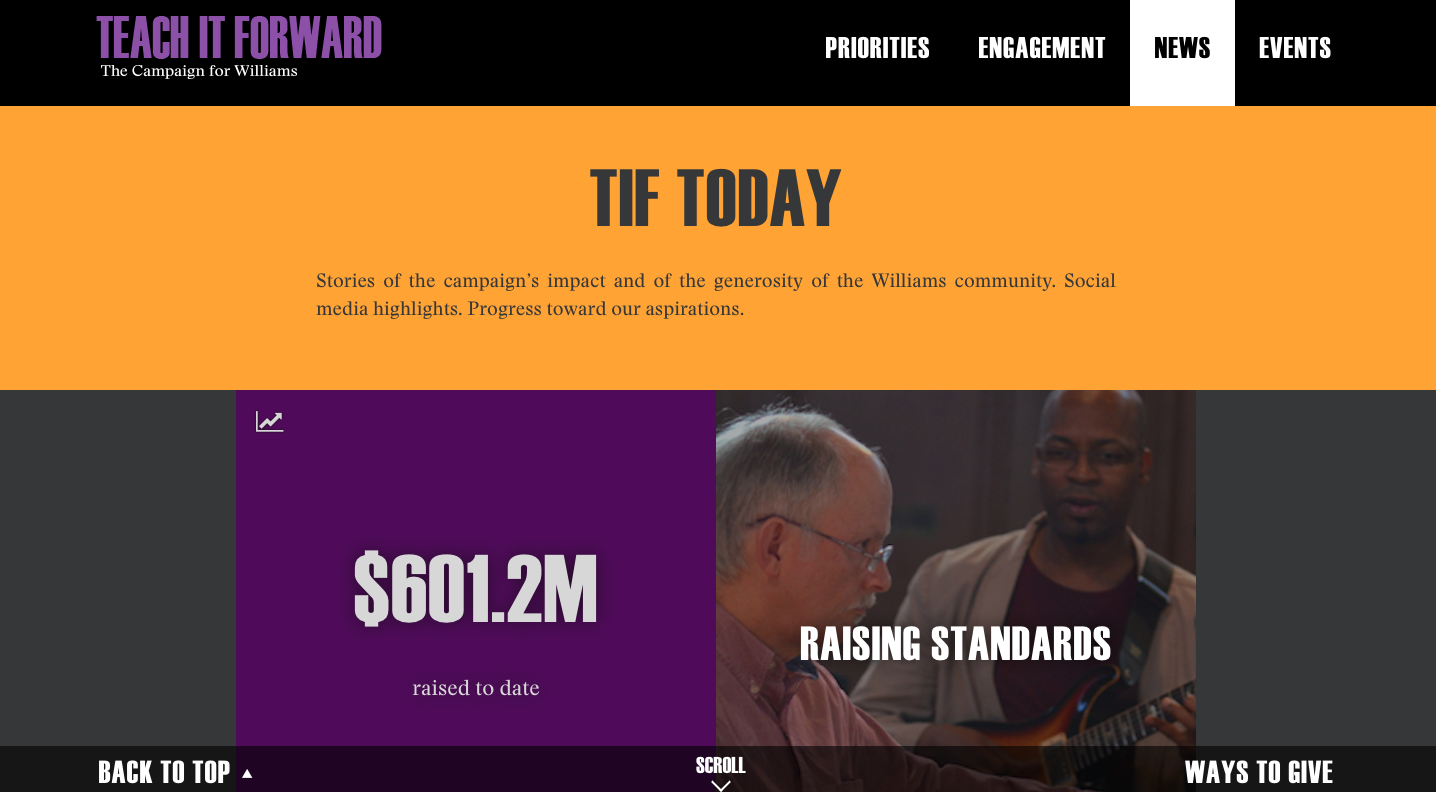
These pages are cohesive in their Williams-centered color scheme, with purple and gold being accentuated, and their layout of information. In keeping with the goal of maintaining the interest and inspiring generosity in busy alumni, both pages rely on visual appeal through images and bolded headings, rather than say a textual list of subtopics, to encourage users to learn more.
This is good design because it facilitates a smooth user experience and is simple to use. Here is the full website for reference.